 I have a confession to make. At 10:30 last night, I was curled up in bed with The Help, trying to finish before our book club met at church, and I read this sentence: "Copy's due on Thursdays. And if I don't like your style, I'm not printing it or paying you squat." Like a thunderbolt, the realization struck: Copy's due tomorrow. Tomorrow is my turn to post on Novel Matters.
 It was no use. By that time of night my brain was fried. I hope you won't stone me for sharing my last post from She Reads (our sister blog) with you instead. I'm wearing my hardhat, just in case. Here goes:
Occasionally I make the mistake of walking into a Michael’s store without a list. Inevitable sensory overload and the lure of cute scrapbooking doodads and glittery beads overwhelm me with possibilities. When I come out of my fog I’m wandering the seasonal aisle with pumpkins and scarecrows and fall leaves. In July. I’ve learned to make a list or at least stop at the entrance to drill myself on why I’m there before crossing the threshold.
I made a similar mistake yesterday when I walked into my local library without a book list. Now, you could put it down to ADHD (which I’m not) or chemo-brain fade (that was 13 years ago) or age (hey, I’m not that old) but I’ll bet you’ve done the same thing. I stood before the tall stacks of books ad infinitum and I couldn’t think of a single author or title I was looking for.
If you are a regular visitor of She Reads, you’ve discovered a way to find great books in the genres or markets that appeal to you. But if you happen to find yourself in a bookstore or library without your list, or if you like to read widely in both fiction and non-fiction or discover hidden gems, what do you do? How does a book make the list?
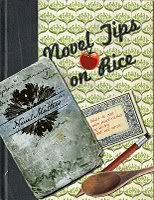
The book’s cover may be where you’d start. Publishers invest a lot of time and money in designing book covers to catch your eye and draw you in. The color, font and design send messages about the story. An Amish cap is unmistakable. Soft colors and a sweet font could be romance or cozy mystery. Historicals are dressed in period costume, and dark images are probably suspense or science fiction. But I checked out a book yesterday (based on the cover & title) that was none of the above. The bright yellow cover with a sweetly framed photo of a car driving down a country lane with two golden retrievers looking on seemed like a nice summer read. Wow. The language was – offensive. And I don’t offend that easily. Unfortunately, this didn’t become manifest until the third chapter in and I felt duped.
Unless the book is on an endcap or facing out, chances are the cover isn’t what you’ll see first. Most books are stacked side-by-side with the title running down the length of the spine. The publisher has about one inch of space to catch your eye. The font and color are important here, but the title and/or the author’s name carry the weight. I thought the (offensive) book I’d chosen had a cute title, but I’ll keep it to myself because I’m not recommending it. (Or finishing it either, for that matter.) If the book is part of a series, there will probably be a clue in the title and you might want to begin with the first one, although it’s usually not imperative.
When a book interests you and you pull it from the shelf, you’ll look first at the cover. Then you’ll probably flip it over to read the back copy. Sometimes, there are only endorsements from other authors or critics, and you have to look at the inside flap to get an idea of the story. Sometimes, not even then. At some point, you’ll flip open the book to the first chapter and read the opening sentence. This can make or break your decision to buy it or check it out. Here are a few opening sentences that convinced me to give these books a try:
“I was sitting in a taxi, wondering if I had overdressed for the evening, when I looked out the window and saw Mom rooting through a Dumpster.” The Glass Castle
“In the town there were two mutes, and they were always together.” The Heart is a Lonely Hunter
“I told you last night that I might be gone sometime, and you said, Where, and I said, To be with the Good Lord, and you said, Why, and I said, Because I’m old, and you said, I don’t think you’re old.” Gilead
“I am ninety. Or ninety-three. One or the other.” Water for Elephants
“It’s hard being left behind.” The Time Traveler’s Wife
By reading the first sentence, you’ll also get an idea of who is telling the story and what tense is being used, but it’s a good idea to flip through if you have a preference. I found one book which began in a perfectly normal viewpoint and multiplied exponentially – every other paragraph was in a different character’s viewpoint. I felt exhausted, just looking at it.
I have a small notepad in my purse now with titles listed that I can refer to the next time I’m cruising for a good book. Or craft supplies. Have you ever been fooled by a book cover or title that misrepresented the content? Do you have an opening sentence that you fell in love with and made you buy (or check out) the book? I’d love to hear.


14 comments:
This is a great post, Debbie! And I'm sure that other busy people missed it on SheReads.
About the cover/spine issue: I have to say that long before I ever knew Katy Popa, I was mesmerized by the title and cover of The Feast of Saint Bertie. It has "my" colors on it, and the richness of the pomegranates and pears and the "seal" behind the title -- I loved it. (And of course the text of the book lived up to all that exotic promise.) Even today, it is one of my favorite books to look at on the shelf, because the spine is so rich and satisfying.
I’m a little obsessed with opening lines. Peace Like a River got me. And as simple as this one is, “I was dreaming of purple horses,” from The Outside Boy, it too got me. Loved Water for Elephants & The Time Traveler's Wife.
~ Wendy
I'm not a big fan of putting too much emphasis on opening lines, though it's like a gift on those occasions where I find a book that is quotable, no matter where in the book the words are.
That said, I did make a book purchase this year based on the opening line, because it implied to me a promise of action. I have sinced passed the book on to someone else, but best I can recall, "Journey to Riverbend" opens with something to the effect of: "It was a small turnout for a hanging."
The best book cover I've seen in the last few years belongs to Athol Dickson's "Lost Mission." I still love that cover. Those warm, orange, other-worldly hues and the mission on the front--I can't explain why, but that cover just draws my eyes back to it again and again.
BK Jackson
http://www.bkjackson.blogspot.com
Glancing at the book spines on my shelf, I see many shades of orange and red. I chose 'Olive Kitteridge' because of the harvest-colored spine. 'Water for Elephants' has that bold red and black striping. I think more of my impulse-buys were due to those colors.
I agree with you, Latayne, about Katie's cover. It was well chosen.
Wendy, the opening paragraph in "Peace" sold me, too.
BK, I'll have to check out 'Journey to Riverbend.' Sounds interesting. Maybe there's something to the orange/red covers. (Any publishers listening?:) I'd be interested to know the stats on colors selling books, if they exist.
Latayne, I'm glad St. Bertie drew you in. Thanks!
I'm a sucker for opening lines. And blue foil. I once circled a book for weeks, realizing, since the description left me flat and I didn't like the opening line, that the only reason in the world I would buy the book was the pretty shiny blue foil on the cover.
Finally I succumbed. Didn't like the book. Loved the cover. Realized years later that a scene in To Dance in the Desert that I thought was original and brilliant, was very like a scene in that book. Very deflating. If I'd liked the book, I would have remembered it, and known at least what it was that influenced me.
The cover of Lisa Samson's "Embrace Me" caught my attention. That book reignited my love for Contemporary Christian Fiction.
Generally, though, when I'm shopping for a new book to read, I open up about half way and read a line here or there. I've found that if I can be intrigued by that, well, I'll be hooked for the whole book.
Susie - THANK YOU! I thought for years I was the only person who judged books by their middles. Opening lines can lie so much, they've usually been worked up so many times they have all the promise of great literature, but it's when you carve a book open you really find out if the voice remains strong and the writing taut.
Of course, the worst times are when the middle draws you in so much you read through to the end, and then have to go read the beginning later.
Most of the books I buy are so old they are coverless and therefore there is no back copy, no reviews and the authors are long extinct from the best seller lists. I bought the Aurelia series sight unseen. All the covers are works of art.
I too dig through the middle of a book to judge its quality.
I think often about the cover of my own work. I do not want any faces, preferring to leave the imagining of the features to my readers. I think blue foil would be delightful, if you could forget your experience, Katy, and try another book so garbed.
I was happy that my second book's cover had no distinguishable faces and Rain (as a child) had her back to the reader. Much better to come up with your own impressions.
I love this article, Debbie.
I've been thinking a great deal about beginnings (remember my video post where I read two different openings to my work in progress? I listened carefully to the feed back many of you gave me about the openings, and I've made HUGE changes that I'm [finally] very happy with)
I've been pondering what makes an opening compelling. Obviously there is a subjective element to any novel's opening -- no story is going to appeal to every reader-- but I think there are specific elements that make a great opening.
I feel a future blog post coming up!
Thanks for this wonderful post, Debbie.
And when it comes to book covers, YES, I'm a sucker for a great cover. But that opening has to be there too. And the writing.
I too am pulled in most by books without faces on the cover. IMO, the good ole juxtapostion of the beautiful woman's face with a collage of different bits of scenery is so overdone it's cliche. I know I shouldn't judge a book by its cover, but it makes me think the book will be cliche too.
Oh, and I'm a middle-browser as well. I like to get a feel for the writer's voice. If I like it, I turn to the first page. Glad I'm not the only one. :)
Bonnie, yay for new beginnings! It was fun seeing your WIP. You're so humble to actually listen to our measly suggestions. It's much easier to have an opinion on someone else's work than to actually produce something brilliant like you do. :)
*cliché*, that is. Finally found the funny-thingy-button.
Hey, Karen, please share. I have no idea where the thingy button is!
Sharon - I'm on a Mac. On my computer I go to the toolbar at the top of the screen, "Edit - Special Characters". Hope you can find it too. :)
Post a Comment